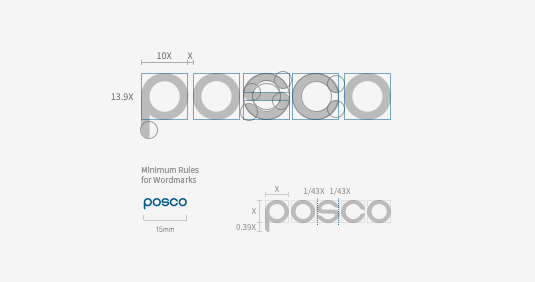
Wordmark Logo
With the letter "S" located at the center, each letter of POSCO has been arranged in a way that creates balance to symbolize POSCO's key principles, e.g. unity and harmonization.
The concentric letters represent POSCO's aspiration for boundless growth - a vision to be achieved by responding to external changes and continuing to innovate.
The concentric letters represent POSCO's aspiration for boundless growth - a vision to be achieved by responding to external changes and continuing to innovate.

Clear Space
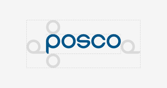
Basic rule
Clear Space is determined by the width of the letter "P" and the height of the letter "O". POSCO wordmark logo should always maintain clear space around perimeter.
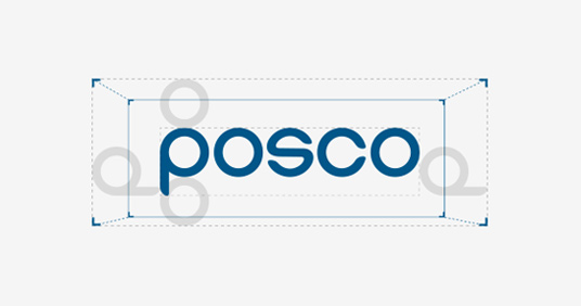
Exception
When inserting the POSCO wordmark into a small box, clear space can be adjusted as displayed in the image above .
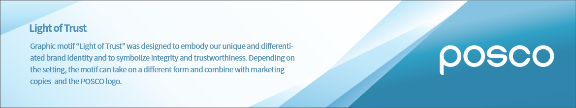
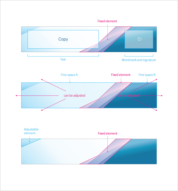
Graphic Motif
Layout
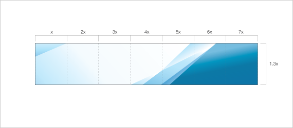
Example
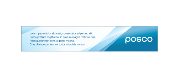
Guidelines
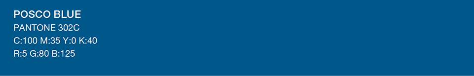
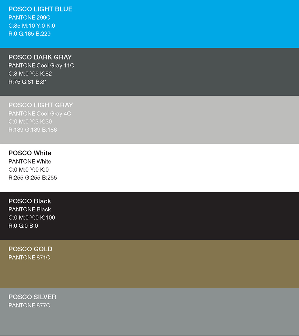
Color Scheme
POSCO Blue represents POSCO's technological prowess and eco-friendly business.
Main Color
Sub Color
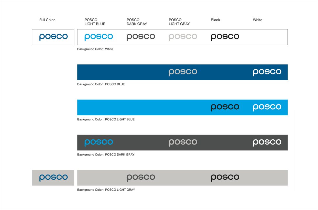
Background Color Rule A
Over a colorful background
Over a black & white background
Background Color Rule B
Incorrect Usage
To establish brand recognition and create a sense of belonging, POSCO Group's 20 domestic and 80 overseas affiliates, employ identical visual elements that represent the business chain's trustworthiness.
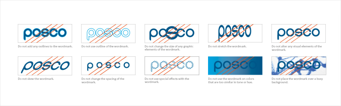
- Do not apply a border to the wordmark.
- Do not outline the wordmark.
- Do not resize the wordmark.
- Do not distort the wordmark.
- Do not change any element of the wordmark.
- Do not skew the wordmark.
- Do not change the spacing of the wordmark.
- Do not add effects on the wordmark.
- Do not use the wordmark on a background color that makes it difficult to identify.
- Do not use the wordmark on a background with complex patterns.